

CRATER BAKES
BEAUTY IN A BOX
THE CHALLENGE
Crater Bakes, a local home bakery known for its artisanal mooncakes, approached us to design their packaging for the 2024 Mid-Autumn Festival season. As a new business that started just the year before, Crater Bakes initially used simple, owner-designed packaging—consisting of a sticker design adhered to pre-made boxes. The logo, featuring a crescent moon creatively forming the letter "C" in Crater Bakes, was also crafted by the owner.
The owner sought our expertise to retain the brand’s existing look and feel while upgrading the packaging to be more environmentally friendly and aesthetically appealing. Her goal was to eliminate plastic waste by designing a custom box with a lid that would perfectly fit her mooncakes. The packaging needed to be classy with an edge, appealing to both young and older customers, while also conveying the brand’s core message: shared humanity, togetherness, the preservation of tradition, slow making, and holistic health.


THE SOLUTION
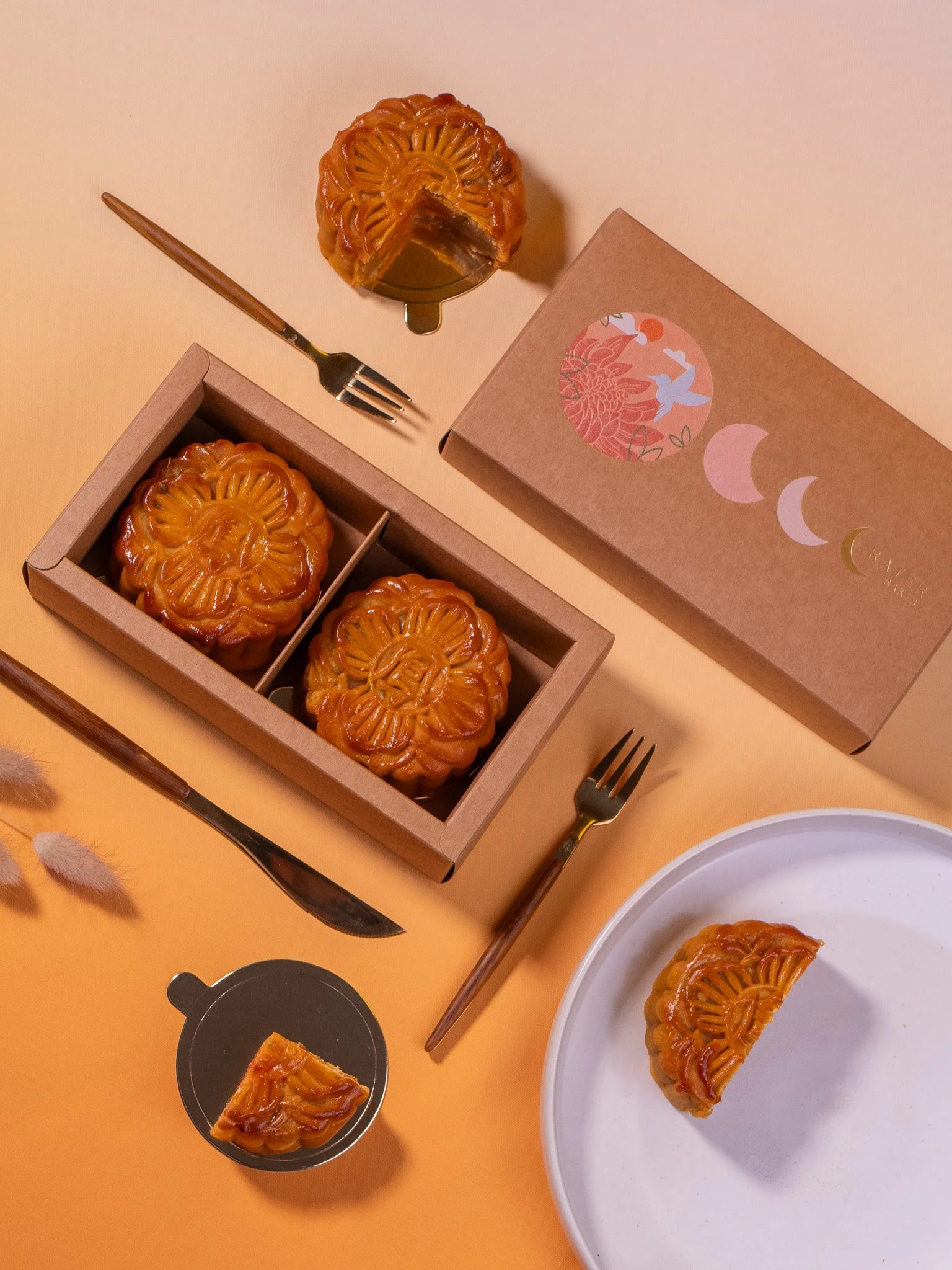
We began by developing an illustration for the box that captured the themes Crater Bakes wanted to convey. The design included:
Chrysanthemums: Symbolizing health and longevity, these flowers added a touch of tradition and well-being.
A Hummingbird: Representing healing and hope, the hummingbird also has spiritual significance, indicating the presence of a loved one’s spirit.
A Round Orange Sun: This element symbolized the abundance of life and echoed the round shape of the mooncake’s egg yolk.
The illustration was set within a circular frame, mimicking the mooncake’s shape and embossed onto the box cover for a tactile and elegant finish.
To meet the owner’s sustainability goals, we designed the box using biodegradable cardboard, custom-made to perfectly fit her mooncakes. We also refined the existing logo, enlarging the crescent moon to better integrate it with the overall design. The logo was then debossed and hot-stamped with gold foil, adding a luxurious touch while symbolizing fortune and compassion.
For the color palette, we infused our aesthetic by incorporating muted pinks and blues that complemented the Crater Bakes branding while also appealing to a broad audience.
After the packaging design was finalized, we conducted a product shoot to create high-quality photos and videos for marketing and branding. We styled the shoot to highlight the elegance and craftsmanship of the packaging, and we also produced a promotional reel, which was posted on Instagram as a collaborative effort with Crater Bakes.


THE RESPONSE
The owner was thrilled with the final design and impressed by the campaign shoot. Customers have given rave reviews about the packaging, noting its beauty, sustainability, and the attention to detail. The product photos and videos have further enhanced Crater Bakes’ brand presence, contributing to a successful mooncake season for the 2024 Mid-Autumn Festival.
